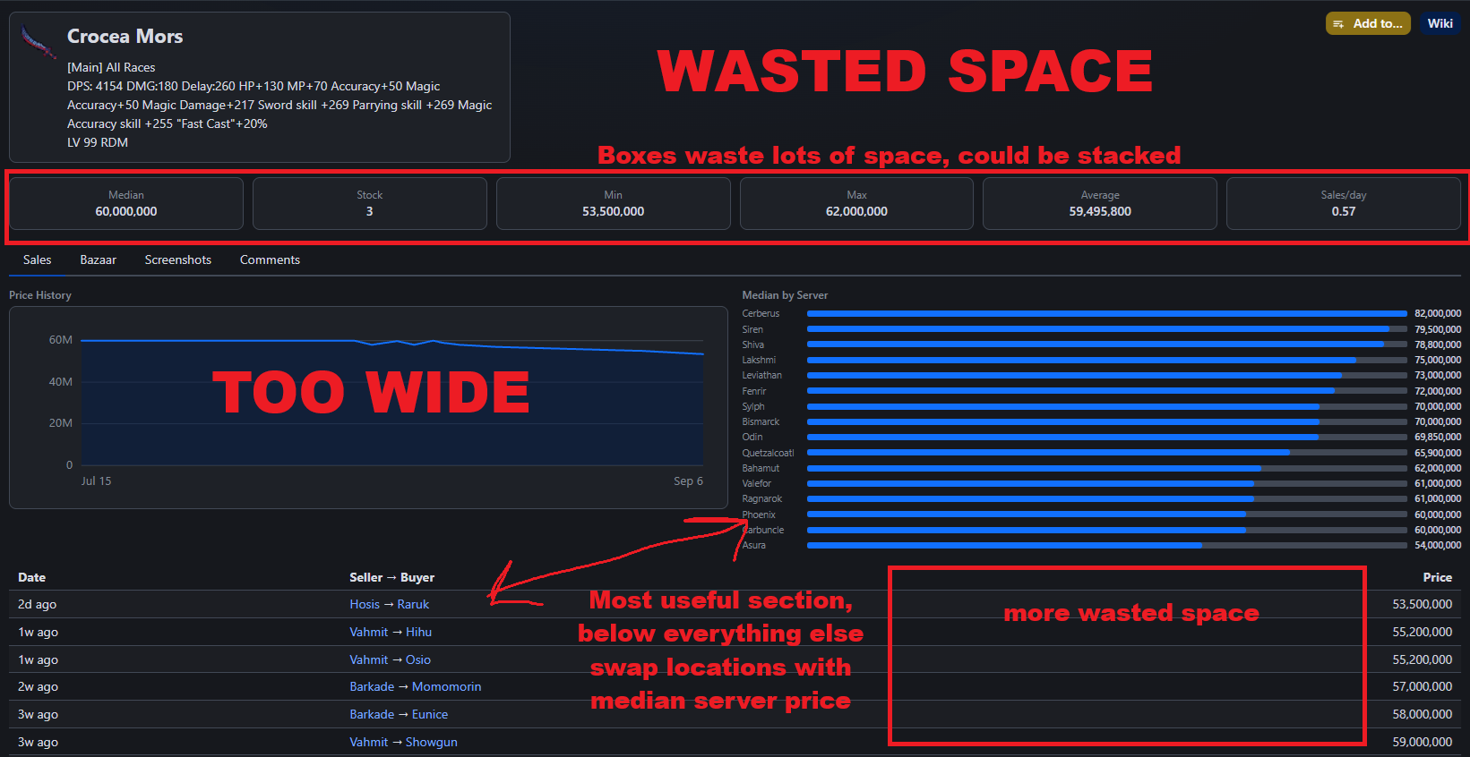
Thanks Scragg!
I like the feel of this new website, I've got nothing to say for the moment about the forum/discussions part, which is likely the part I use most on this website.
On mobile especially this feels way better.
I don't share the concerns Maletaru express but I've got some of my own.
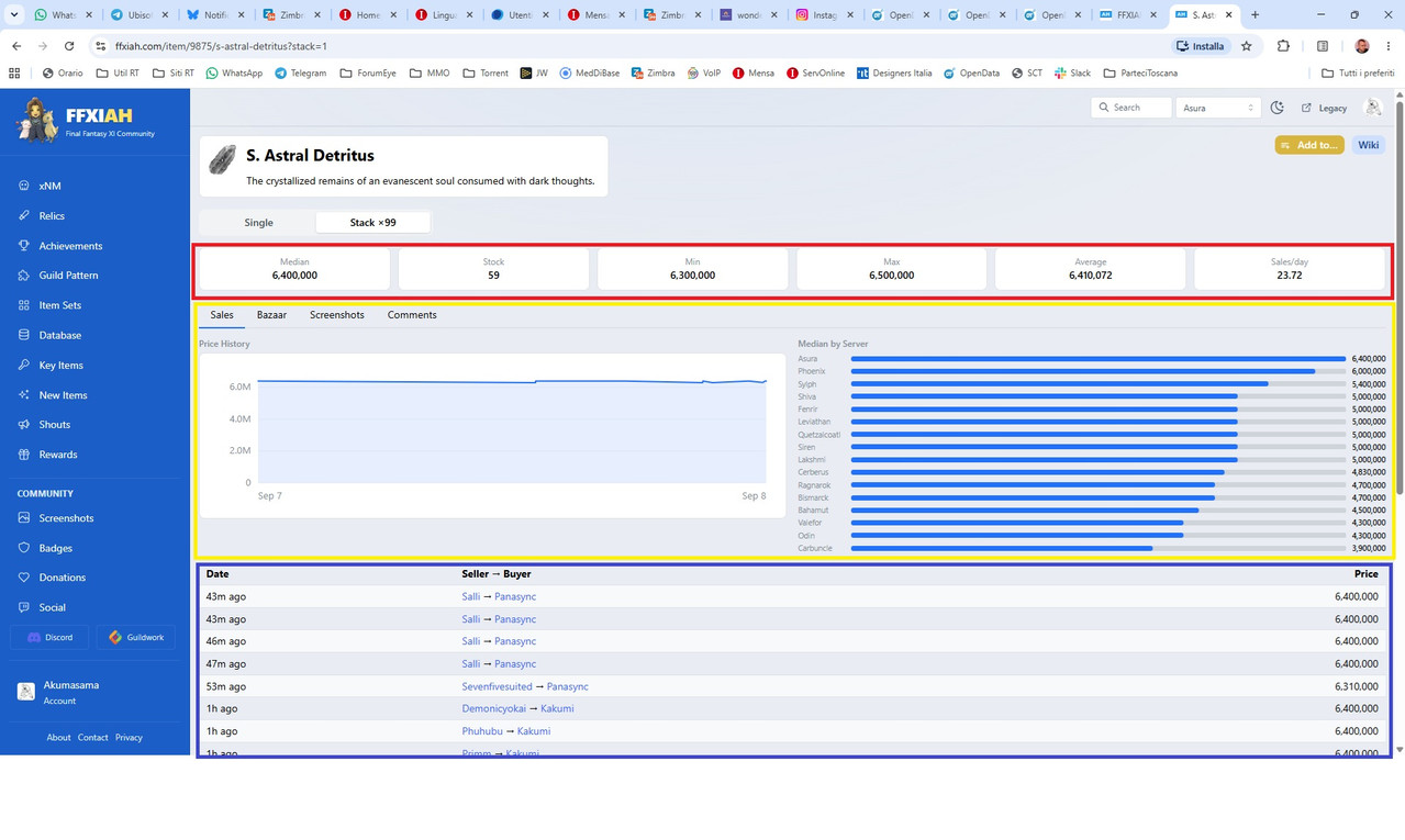
See the three colours?
From top to bottom atm it goes Red, Yellow and finally Blue.
In my opinion the order should be different.
Blue should be the very first "item" in the page order. Seeing the list of prices is imho the most important thing and hence should be placed as first on top.
Then I would put Red and finally Yellow.
I've got mixed feelings with the fact that bazaar, images and especially comments are now on different "tabs". With the old layout you see them all on the same page and I find that useful.
Altough that's probably a minor thing and it might be mostly a matter of getting used to it, I suppose. Let's give it some time and see how it feels for all of us one month from now.
But concerning the order thing I mentioned above,
personally I think that's one thing that I would change right now.
My opinion is that, overall, this new layout optimizes things
a lot for mobile devices/vertical layouts, but it feels like there's a bit of wasted space and opportunities for desktop setups with at least 1080p and even worse if you go higher.
Again I'm talking about the items browsing and related stuff, no concerns about the forum threads/discussions.
Altough I can say one small thing about the
front page.
The old layout displayed 9 "last threads", the new one displays just 8.
I think you could reduce the size of the thread boxes a bit (they look very big in desktop setup after all) and allow for a display of the 10 last threads instead of the current 8.
Making them slightly more compact in the front page would also help reduce the feel of "wasted space" on desktop devices 1080p and higher.